Blog
Introducing a new look for the Child Mind Institute
We’re thrilled to unveil a redesigned brand identity, created in partnership with Beardwood & Co. and Constructive, that will further advance our mission to transform children’s mental health. Whether you’ve followed us for over a decade or have just discovered us today, we’re grateful for the opportunity to (re)introduce ourselves.
Why a rebrand?
Our focus has always been on creating a brighter future for our children; in these challenging times, our work has been more important than ever. This redesign, the first in our organization’s history, set out to achieve three critical goals:
- Create a new brand logo that continues to project our clinical and scientific expertise, yet is also warm, approachable, and impactful.
- Build out a visual toolkit that gives the Child Mind Institute a distinctive and contemporary look and feel across all communications.
- Redesign our website so that it brings the brand to life, while supporting several key objectives:
- Clearly communicate our Mission and how we achieve it.
- Simplify navigation, so visitors can find what they need faster.
- Launch a new Family Resource Center, developed through a generous grant from the Morgan Stanley Foundation, that focuses on inclusivity, clarity, and accessibility, so more families can connect to educational resources and care.
Our most critical work involves bringing care directly to kids that need it the most, giving parents the information they need, fighting stigma, and advancing scientific knowledge. But it’s also important that we communicate what we’re doing as powerfully as possible. To this end, we were excited to learn that our new logo was preferred to our prior one by an over 4:1 margin.
Jeffrey Chapman, VP of Marketing & Communications
What’s new?
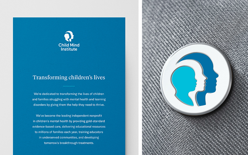
A modernized logo anchors our rebrand, boldly representing our commitment to progress and hope.
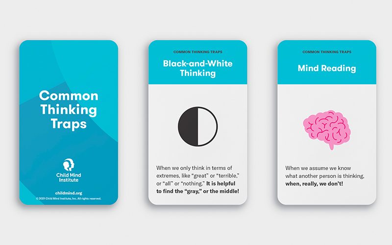
Paired with the tranquility of our existing brand blues, a new and vibrant secondary color palette adds brightness to the system. Individual palettes are used to represent each of our mission areas, while all work together to add energy and optimism to our brand.
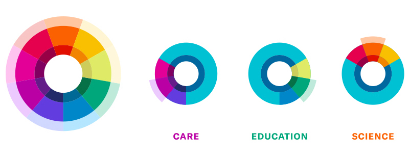
Care
Magenta symbolizes love, compassion, patience, and respect
Education
Green symbolizes wisdom, evolution, honesty, and growth
Science
Orange symbolizes creativity, determination, encouragement, and progress
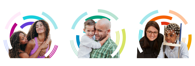
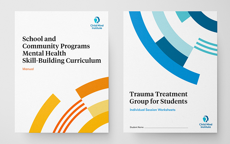
Our graphic “Growth Rings” are distinctive representations of discovery and change. Able to be paired with photography and to be used on their own, they add depth, texture, and movement to our system.
What’s next?
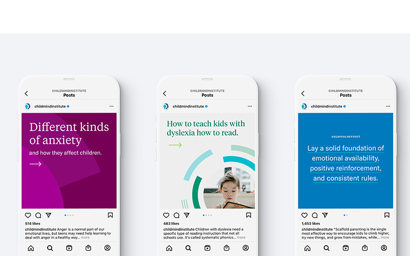
Over the coming months, we’ll continue to push our new look across our physical locations, digital platforms, external communications, and training materials.
Pairing optimism and empathy with clinical expertise, our new identity sets the stage for growth — creating an experience that is more informative, intuitive, and inclusive. We hope that you agree.